Benefit image
Asset type on EML:
Benefit image
Keyword to find on EML:
Benefit
EML code:
BI
Consumer journey:
Discovery/Selection
Description:
Supports the benefit copy by illustrating the benefit. One image per benefit.
Product neutrality:
Yes, when possible
Activation:
Brand website/Product detail page in gallery view driven by PNC & benefit module (images and text)/E-tailers/Social media. Top 3 benefits images (at least) are used on packaging for SDA/Wellbeing
Mapping:
Mapped to all PNC’s that have that specific feature or benefit, hence product neutrality. Connected to PIC Ref.
Story asset based on:
Eden Benefit copy
Aspect ratio(s):
Native & 1:1
Examples


Specific consideration for asset type
-
Supports the benefit copy by clearly illustrating the benefit
-
One image per benefit
-
Story: based on Eden benefit copy
-
Demonstrate the technology or the end result (benefit)
-
Product neutral if possible
-
App/UI-neutrality for products that have an app or a UI
-
Utilize infographics to their full potential
-
When combining icons with your images please ensure the correct Electrolux blue (RGB 4/30/80) is maintained.
-
For copy design specifics, refer to On-screen text
-
English source defines font sizes, font styles, margins and breathing space. It’s our baseline for applying localization.
Master file (uploaded to EML):
-
Aspect ratio: 4:3
-
Resolution: a minimum height of 3508 pixels
-
Colour profile: ADOBE RGB 1998
-
Output file format to EML: TIFF (if the master image contains any OST / OSG elements, the agency has to deliver a TIFF master file with layers where OST and OSG are placed on separate layers and grouped into respective folders), as well as add the clipping paths following the required sub-formats aspect ratios and naming’s (see Technical requirements)
-
Open source file definition: The open source file for this asset = master file as it contains all necessary layers. Eg+ can directly download the master file from EML for localization purposes.
General considerations for asset type
Benefit (comparison) image
Benefit image can also be executed as comparison to communicate a difference between two ways of…(washing, drying, baking etc..)
This comparison can have different layouts - either a vertical split-screen or a side-by-side. In both cases, the left side is traditional and right side is an improvement by Electrolux. Pop-up text should be always added for clarity and framing should allow for 1:1 crop of the image. Vertical split screen is separated by a white vertical line.
Asset type on EML:
Benefit image
Keyword to find on EML:
Comparison
EML code:
MP
Consumer journey:
Discovery/Selection
Description:
Created to communicate a difference between two ways of…(washing, drying, baking etc..) Often used as benefit image.
Product neutrality:
yes/does not apply
Activation:
Website, either in gallery view or in benefit view/ Instore POS material/Social media
Mapping:
Mapped to all PNC’s that have that specific feature or benefit, hence product neutrality. Connected to the PIC Ref.
Story asset based on:
Requested custom copy
Aspect ratio(s):
Native
Examples


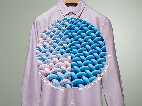
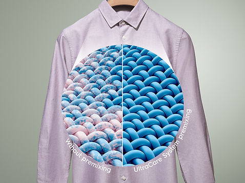
Macro image
Macro image is a special type of a comparison image, where the comparison is located in a magnifying-glass-like circle. The circle can be connected to the part of the image it refers to with a semi-transparent "stream", but doesn't need to.
Just like with regular comparison images, the correct (Electrolux) outcome is located on the right side. Both sides are labeled with text positioned around the bottom part of the circle. Text size is image width divided by 36, in px.


Photoshop templates
You can download Photoshop templates for all three benefit image types below The templates contain all pre-defined text types and On-screen Graphics in proper sizes.
The template has a resolution of 4678x3508 px. If your artwork has a higher resolution, you can simply upscale the template - all elements are in vector format, so no quality loss will occur.